For Lord of the Black Mountain. It is here.
So, despite being eternally broke due to a fixed income, I decided to commission artist Melukilan for a new cover. (I am on a general chat server and a roleplaying server with her.) She had been drawing pictures of characters (I was playing Jhan and [Redacted] in the game) and had been commissioned to create Tarot-style drawings of our characters. (The ones she did of mine were so cool!)
We hashed out the details of I wanted, and she started with a few early sketches that were discarded, and then moved on to the sketches we finally went with. (We were more detailed about the picture than the final pricing, but such is the situation when you are commissioning a friend. We did settle on a price/number of payments and all went smoothly.
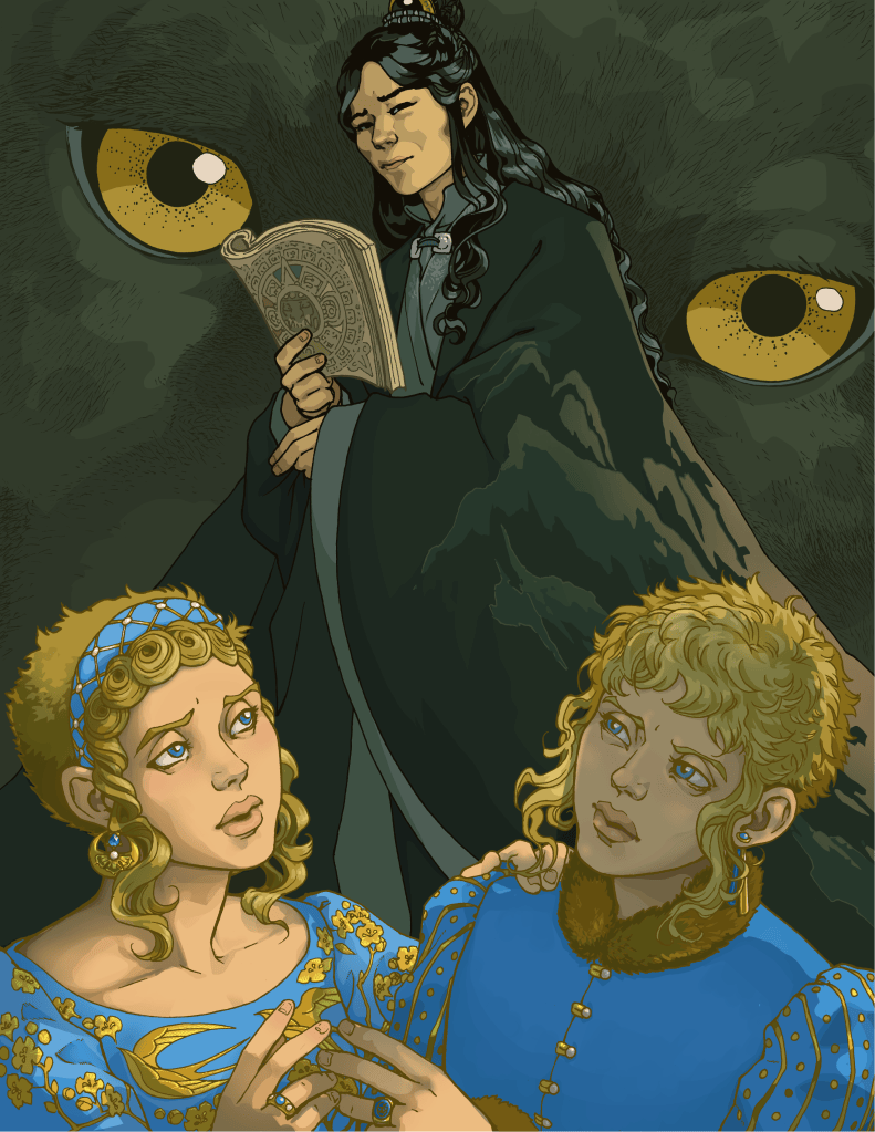
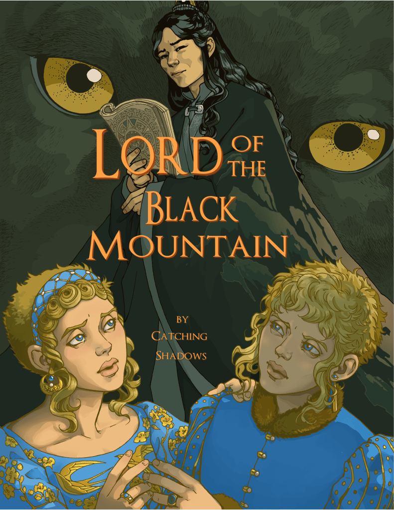
One god, one baffled professor, and two idiots royals.
So, I made this with paint.NET which is a great program, though you often have to plug in a lot of plug ins before you can do things such as oh, edit/change the size of the text after you hit enter.
I did not have editable text installed on this computer. But I found a techniques where you can fake editable text. One involves putting each word of the title on separate pages and arranging them that way. The second is for when you need to rework the layout of your title. This involves copying each bit of title you want to break up onto separate layers.
In either case, make sure your title is transparent when you do this! Or you will have to do it all over again. For changing the size/shape, use the rectangle select and the move arrow. This should change the select into a shape/size rectangle.
As you can see, the artist left me a lot of room to fit a title in. Also, I love the positioning of the characters, and the general look of our friendly neighborhood immortal necromancer dude. Now, you are not only not supposed to put the title too close to any margins, but you are also not allowed to cover the faces of the characters. I created a layer, and used the line tool to create guides marking off the the no go zones and wondered why I’d never considered doing this previously.
The first go at the title, and went with brighter gold text, with a dark brown drop shadow that too my eyes made the words pop out. I also had the words of the title staggered in a little stair-step configuration. This unfortunately covered up part of the jaguar’s eye. Also, the colors were too blended in too much. Orange was suggested by Nachtour (friend/friendly acquaintance from tumblr and Discord) as a color that would stick out a little more.
So first I messed around with hue/saturation until I got the color I wanted. Then…I cut up the title, changing sizes and shape until I had them where I wanted them. (This took some doing as while I could get copies of the words taken out, I just as often made some wrong step in the process, and wasn’t able to see the copy of the bit of title I’d copied.
I rearranged everything until I came up with a layout I didn’t hate. Then I made a png of the cover, (well a few pngs) of the newer cover.
Some Notes: The font is a free font I got from DaFont. It’s called Optimus Princeps and it’s by Manfred Klein.


Leave a comment